10 Pro Tips for Creating Responsive ColdFusion Web Designs at Full Blown Studio
Posted Oct. 5, 2025 by Full Blown Studio

Introduction
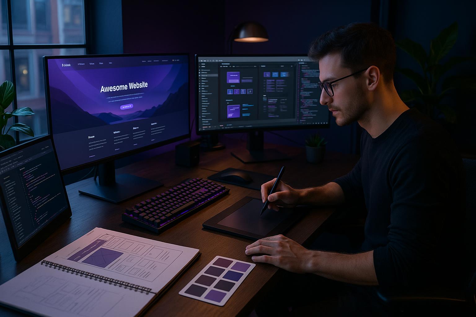
Creating effective and engaging Responsive ColdFusion Web Designs is essential in today's digital landscape. As more users access the web through various devices, the need for websites that adapt seamlessly to different screen sizes has never been more critical. ColdFusion, a powerful web application development platform, offers unique solutions for building responsive designs that enhance user experience while ensuring robust functionality. In this blog post, we’ll explore ten expert tips for developing outstanding Responsive ColdFusion Web Designs that resonate with users and drive engagement.1. Understand the Basics of Responsive Design
Before diving into the technical aspects, it’s important to grasp the principles of responsive design. This involves using fluid grids, flexible images, and media queries to create a website that adjusts smoothly across devices.- Fluid Grids: Utilize relative units like percentages instead of fixed units (pixels).
- Flexible Images: Ensure images scale correctly using CSS techniques.
- Media Queries: Use CSS media queries to apply different styles based on device characteristics.
2. Leverage ColdFusion’s Built-in Features
ColdFusion provides various tools and features that can simplify the process of creating responsive designs. Some notable features include:- CFCs (ColdFusion Components): Use these to encapsulate functionality and promote reusability.
- CFML (ColdFusion Markup Language): Integrate CFML to streamline your code and enhance responsiveness.
- Built-in Functions: Take advantage of ColdFusion’s functions for managing data and user interactions efficiently.
3. Prioritize Mobile-First Design
With mobile devices dominating web traffic, adopting a mobile-first approach is crucial. Start designing for smaller screens and progressively enhance the experience for larger displays.- Sketch your layout for mobile devices first.
- Ensure essential content is accessible without scrolling.
- Scale up features and elements as screen sizes increase.
4. Optimize Performance
Performance is key in creating a successful Responsive ColdFusion Web Design.- Minimize HTTP requests by combining files (CSS, JS).
- Enable compression to reduce file sizes.
- Leverage caching strategies to decrease load times.
5. Utilize CSS Frameworks
Frameworks like Bootstrap or Foundation can expedite the development process for Responsive ColdFusion Web Designs. These frameworks come with pre-built components that are already responsive.- Use grid systems for layout consistency.
- Incorporate ready-to-use UI components.
- Benefit from community support and documentation.
6. Test Responsiveness Across Devices
Regular testing is vital to ensure your Responsive ColdFusion Web Designs function well across various devices. Use tools and emulators to simulate different environments.- Use browser developer tools for quick tests.
- Employ online services like BrowserStack for comprehensive testing.
- Collect feedback from actual users on multiple devices.
7. Implement Adaptive Images
Images are a significant part of web design, and ensuring they are responsive is crucial. Implement techniques such as:- Using the srcset attribute to serve different image resolutions.
- Utilizing CSS to control image size dynamically.
- Optimizing images for faster loading without sacrificing quality.
8. Keep Navigation User-Friendly
Navigation plays a key role in user experience. For Responsive ColdFusion Web Designs, consider:- Using hamburger menus for mobile devices.
- Ensuring easy access to key sections of the site.
- Maintaining consistency in navigation elements across devices.
9. Focus on User Experience (UX)
A successful website is one that offers a great user experience. This involves:- Creating a clear visual hierarchy.
- Using legible fonts and appropriate sizes.
- Incorporating interactive elements that are easily accessible.
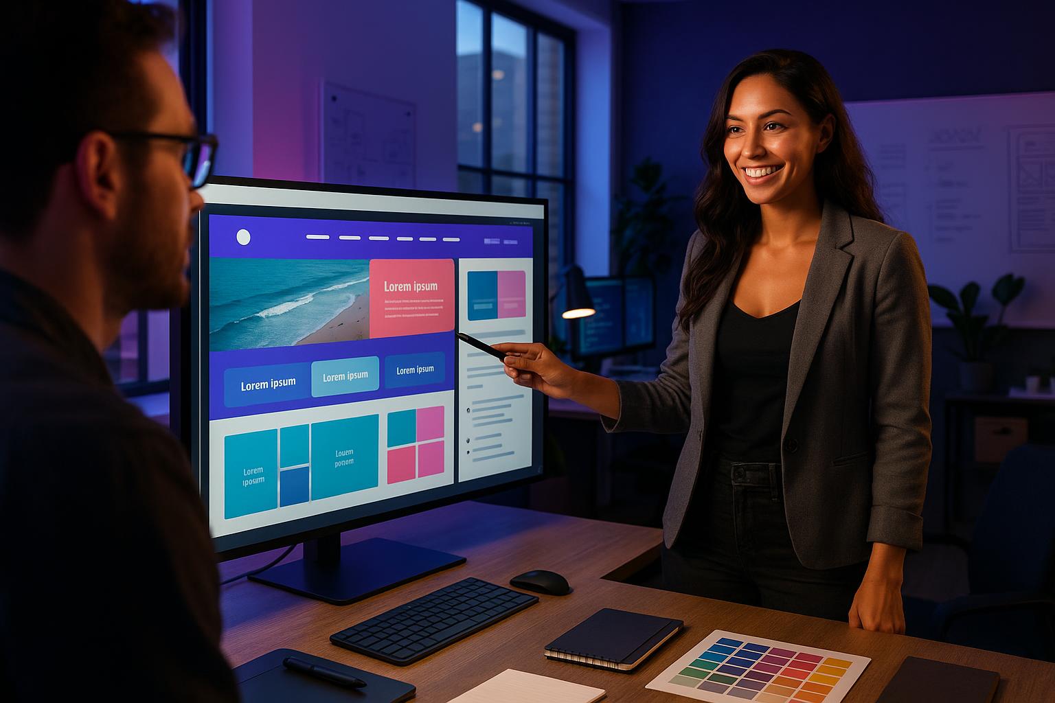
10. Collaborate with Experts
At Full Blown Studio, we have a team of certified expert ColdFusion developers and advanced graphic designers who specialize in Responsive ColdFusion Web Designs. Partnering with professionals ensures your website is not only visually appealing but also functionally robust.Frequently Asked Questions
1. What is responsive web design?
Responsive web design is an approach that ensures a website looks good and functions well on all devices, from desktops to smartphones, by using flexible grids and layouts.
2. How does ColdFusion support responsive design?
ColdFusion supports responsive design through various features, including CFML for dynamic content management and built-in functions that streamline development.
3. Why is a mobile-first approach important?
A mobile-first approach is essential due to the increasing use of mobile devices to access the internet, ensuring that the design prioritizes mobile users' needs.
4. What tools can I use to test my responsive design?
You can use browser developer tools, online services like BrowserStack, and real devices to test how your design performs across different screen sizes and resolutions.
5. How can I improve the loading speed of my responsive site?
To improve loading speed, minimize HTTP requests, enable compression, optimize images, and leverage caching strategies.
Contact Full Blown Studio
In summary, creating effective Responsive ColdFusion Web Designs is not just an option; it's a necessity for engaging users and enhancing their experience. With our certified expert ColdFusion developers, advanced graphic designers, and database experts, Full Blown Studio is your go-to partner for exceptional web design solutions. For more information, please contact us at support@fullblown.com or call (661) 429-0940. We look forward to helping you create a stunning and responsive website that meets your needs and exceeds your expectations.Recent Blog Posts


 April 23, 2026
ColdFusion Programmer for Custom Web Development: Best Practices from Full Blown Studio


 October 9, 2025
Expert Tips from a ColdFusion Programmer for Custom Web Development at Full Blown Studio


 September 30, 2025
Elevate Your Business with Custom ColdFusion Web Design Services at Full Blown Studio
 September 29, 2025
Expert Tips from ColdFusion Web Developers at Full Blown Studio for Custom Web Design Success


 September 26, 2025
Expert Tips from a Full Stack Programmer at Full Blown Studio for Custom Web Design
 September 25, 2025
Elevate Your Business: Top 7 Reasons to Hire ColdFusion Web Developers at Full Blown Studio

 September 24, 2025
Why Hiring Certified ColdFusion Web Programmers Boosts Your Custom Web Design Success
 September 24, 2025
Boost Your Business with Custom ColdFusion Programming: Expert Tips from Full Blown Studio


 September 22, 2025
Expert Tips from ColdFusion Web Developers at Full Blown Studio for Stunning Custom Designs


 September 17, 2025
Discover the Top Web Designers in Pacific Palisades: Expert Tips from Full Blown Studio
 September 16, 2025
Elevate Your Business with a Custom ColdFusion Web Programmer at Full Blown Studio
 September 16, 2025
Expert Tips for Creative Web Designs Acton: Elevate Your Online Presence with Full Blown Studio
 September 15, 2025
Boost Your Business: How to Rank High in the Search Engines with Full Blown Studio's Expert Tips

 September 14, 2025
Discover the Top Web Designers Santa Monica: 7 Expert Tips for Your Custom Project
 September 14, 2025
Discover the Top Web Designers in Pacific Palisades: Expert Tips for Custom Solutions
 September 13, 2025
Expert Tips for Exceptional Website Development Santa Clarita by Full Blown Studio


 September 12, 2025
10 Expert ColdFusion Programmer Tips for Stunning Custom Web Designs at Full Blown Studio


 September 6, 2025
Elevate Your Brand with Expert Web Design Stevenson Ranch: Top Tips from Full Blown Studio

 September 5, 2025
Expert Tips from ColdFusion Web Developers at Full Blown Studio for Custom Designs
 September 4, 2025
Maximize Your Online Presence: Expert Search Engine Optimization Tips from Full Blown Studio


 September 2, 2025
Discover the Top Web Design Agency Santa Clarita: Expert Tips for Stunning Custom Designs


 August 26, 2025
Master Search Engine Optimization: Expert Tips for Custom Web Design Success at Full Blown Studio

 August 25, 2025
10 Expert ColdFusion Programmer Tips to Elevate Your Web Design with Full Blown Studio

 August 24, 2025
Elevate Your Business with a Custom ColdFusion Web Programmer from Full Blown Studio


 August 22, 2025
Expert Tips for Stunning Web Design Valencia: Elevate Your Online Presence with Full Blown Studio


 August 17, 2025
Boost Your Business: 7 Expert Tips to Improve Search Engine Ranking with Full Blown Studio


 July 31, 2025
Elevate Your Business with Expert Web Design Stevenson Ranch: Top Tips from Full Blown Studio


 July 29, 2025
Boost Your Business with Santa Clarita Custom Web Developer Expertise at Full Blown Studio
 July 29, 2025
Boost Your Business: 7 Expert Tips to Improve Search Engine Ranking with Full Blown Studio


 July 25, 2025
Elevate Your Brand with Santa Clarita Web Design Agency Expertise: Pro Tips from Full Blown Studio


 July 22, 2025
Master Search Engine Optimization: Pro Tips from Full Blown Studio for Custom Web Design Success


 July 21, 2025
How to Rank High in the Search Engines: 7 Expert Tips for Custom Web Design Success in LA

 July 20, 2025
Expert Tips for Stunning Web Design Stevenson Ranch: Custom Solutions by Full Blown Studio
 July 19, 2025
Boost Your Business with Creative Web Designs Acton: 7 Expert Tips from Full Blown Studio


 July 18, 2025
Boost Your Online Presence: 7 Expert Tips to Improve Search Engine Ranking with Full Blown Studio
 July 17, 2025
Elevate Your Business with Coldfusion Web Designs Santa Clarita: Expert Tips from Full Blown Studio


 July 12, 2025
Boost Your Business: 7 Expert Tips to Improve Search Engine Ranking with Full Blown Studio

 July 11, 2025
10 Essential Modern Web Design Techniques to Elevate Your Brand with Full Blown Studio


 July 8, 2025
Elevate Your Brand with Santa Clarita Web Design Agency: Expert Tips & Custom Solutions
 July 7, 2025
Expert Tips for Effective Website Development Santa Clarita: Elevate Your Online Presence


 July 5, 2025
Elevate Your Brand with Creative Web Designs Santa Clarita: Expert Tips from Full Blown Studio


 June 29, 2025
Expert Tips for Stunning Web Designs Valencia: Elevate Your Online Presence with Full Blown Studio


 June 12, 2025
Expert Tips from a ColdFusion Programmer for Custom Web Development Success at Full Blown Studio


 June 10, 2025
10 Essential Skills Every Full Stack Programmer Needs for Custom Web Design Success at Full Blown Studio


 May 31, 2025
Discover the Top Web Designers in Pacific Palisades: Expert Tips from Full Blown Studio


 May 29, 2025
Mastering Search Engine Optimization: Pro Tips from Full Blown Studio for Custom Web Design Success
 May 28, 2025
Elevate Your Brand with Expert Web Design Stevenson Ranch: Top Tips from Full Blown Studio


 May 17, 2025
Expert Tips for Stunning Web Design in Pacific Palisades: Elevate Your Brand with Full Blown Studio
 May 17, 2025
Elevate Your Brand with Creative Web Designs Santa Clarita: Expert Tips from Full Blown Studio


 May 13, 2025
10 Essential Modern Web Design Techniques by Full Blown Studio for Stunning Custom Sites


 May 11, 2025
Boost Your Website's Visibility: Top 10 Search Engine Tips for Google from Full Blown Studio


 April 30, 2025
Elevate Your Brand with Creative Web Designs Santa Clarita: Expert Tips from Full Blown Studio


 April 28, 2025
Master Custom ColdFusion Programming: Expert Tips for Stunning Web Design by Full Blown Studio


 April 26, 2025
Expert Tips from the Best Web Design Agency Santa Clarita: Elevate Your Online Presence

 April 25, 2025
Elevate Your Brand with Expert Web Design Stevenson Ranch: Top Tips from Full Blown Studio


 April 22, 2025
Elevate Your Business with Full Blown Studio: A Premier Professional Web Design Agency


 April 12, 2025
Transform Your Business with ColdFusion Web Design and Hosting from Full Blown Studio


 April 9, 2025
Unlock Your Business Potential: Top 5 Reasons to Choose Full Blown Studio as Your Web Design Agency Palmdale